
Because it is laid out in columns, this site doesn't display properly on a phone held vertically.
Please turn it sideways.
Because it is laid out in columns, this site doesn't display properly on a phone held vertically.
Please turn it sideways.
Why is information design so hard to do well?

Why is information design so hard to do well?
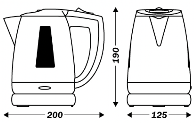
In Notes on the Synthesis of Form, Christopher Alexander1 uses the design of a simple kettle to demonstrate the great many interacting factors a designer must consider, even with the most basic of products – getting the water in, getting it out, safety in handling, stability, cost to produce, corrosion resistance. He lists twenty-one in all, and alludes to the much greater complexity of designing a car.
The design process for a kettle may be complex, but it is a single stage that can be entrusted to a competent specialist designer, after which the kettle is manufactured, sold to users, and then used confidently – because all kettles are used in mostly the same way. Industrial designers, architects, and even service designers can create concepts and specify them for manufacturing or implementation by others.
But information design is different – almost every instance of it needs be individually crafted by someone who knows what they are doing, and cares. Information design gurus can pose as loftily strategic, but in reality it’s the quality of detailed decisions that matter – decisions about the words, the layouts, the interactions.
1. Alexander, C. (1964). Notes on the synthesis of form. Harvard University Press. (Page 61).