
Because it is laid out in columns, this site doesn't display properly on a phone held vertically.
Please turn it sideways.
Because it is laid out in columns, this site doesn't display properly on a phone held vertically.
Please turn it sideways.
Everything the reader can see is potentially meaningful – even when it isn’t.

Everything the reader can see is potentially meaningful – even when it isn’t.
Some visual phenomena are essential to the author’s message, and some are just accidental by-products of the production process.
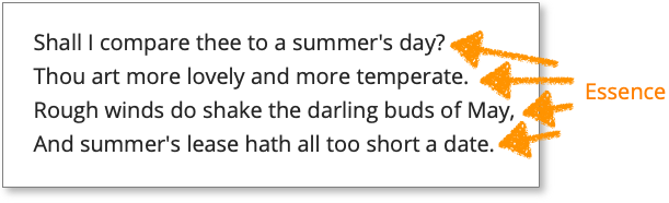
Take line endings. Sometimes they are essential – at the end of a heading, an item in a list, a line of poetry or after the last word of a paragraph.
The first four lines of this Shakespeare sonnet fit on the page, so each line ending is intended by the poet, and therefore essential to his structure.
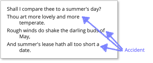
Now if I make the page narrower, we have a new set of forced line breaks not intended by the poet. They are accidental and arbitrary so carry no meaning.
The same is true of diagrams – when a line bends to avoid the edge of the page, is that essence or accident?
There’s a related issue, which I’ll call Ornament. We accept that traditional poetry has formal qualities: sonnets have 14 lines with a particular rhyming pattern. But why should so many diagrams be symmetrical, and why should so many concepts fit into patterns like ‘the 5 Ps’.1
It makes the diagram easier to draw, but also raises the suspicion that items have been added just to balance it.
And what if one relevant concept didn’t start with a P? Again, you suspect that the thinking might have been driven by the format.
Critical techniques such as switch tests or design pattern critiquing can help you decide.
1. For example, the classic 5 Ps in marketing: Product, Price, Place, Promotion, and People.