
Because it is laid out in columns, this site doesn't display properly on a phone held vertically.
Please turn it sideways.
Because it is laid out in columns, this site doesn't display properly on a phone held vertically.
Please turn it sideways.
Using graphic solutions to make a text clearer

Using graphic solutions to make a text clearer
Here is a typical piece of regulatory writing – it’s a mesh of related concepts and conditionals.
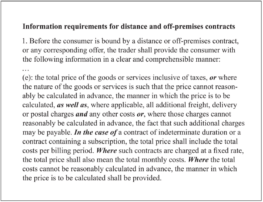
To use this text in a practical context, I have to identify the parts that apply to me, while ignoring the parts that do not apply to me. But the irrelevant parts are still there, embedded in the text I am reading, and acting as plausible distractors, a term describing possible but wrong answers to a reader’s question.
To improve this, my first step was to identify the turning points in the text – cohesive words and conditionals such as ‘or’, ‘in the case of’ or ‘where’. I was then able to find systematic relationships in text, eventually settling on the tabular version below.
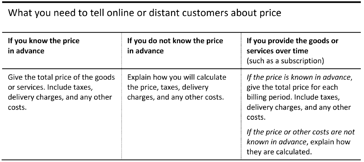
My main moves were:
This is what we called graphic editing in our design agency.
Even if this text were to be transformed into the plainest of language, but still in a linear form, the reader would have to process it in working memory while cycling around and re-reading to confirm their understanding.
For example, when they encounter ‘such contracts’ they must retrieve from memory what previously mentioned contracts, are referred to. Similarly, ‘the total price shall also mean…’ asks them to remember what the total price has already been defined as meaning.