
Because it is laid out in columns, this site doesn't display properly on a phone held vertically.
Please turn it sideways.
Because it is laid out in columns, this site doesn't display properly on a phone held vertically.
Please turn it sideways.
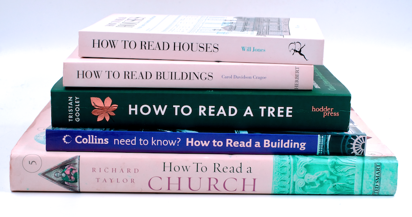
Architects sometimes talk of reading buildings as if they were messages.

Architects sometimes talk of reading buildings as if they were messages.
Architects and information designers frequently use metaphors from each other’s domains.
Information designers speak of user journeys, and navigating a document or a website, as if it were a spatial environment, while architects speak of reading a building, as if it were a message.
When, following Kevin Lynch’s seminal The Image of the City (1960), we speak about legible environments, we’re looking at something altogether more significant and strategic than when we speak of legible books.
In print and on screen, legibility describes how easily we can read at the level of the word and the line. It is a hygiene factor – the equivalent of an architect getting the right pitch for a flight of steps, or the right height for a doorway.
But legible environments are about the clarity of structure – clear pathways, areas and edges that explain a city and enable to us to form a coherent mental model to help us navigate it.
Unlike architects and planners, we have no word for the ease with which we can see typographic structures: the way topics are diagrammed through layout, the distinctions between different kinds of content, the clear and natural flow between pictures and text. It’s a pity.
This page is adapted from: Robert Waller (2011) Places need signs: Information design, architecture and making buildings readable, Eye 80 vol. 20.