
Because it is laid out in columns, this site doesn't display properly on a phone held vertically.
Please turn it sideways.
Because it is laid out in columns, this site doesn't display properly on a phone held vertically.
Please turn it sideways.
A simplistic but useful timeline of document use
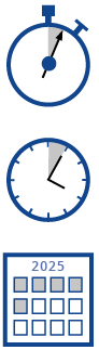

A simplistic but useful timeline of document use
You open an email about your home insurance, and click on a link.
What do you see in the first 5 seconds? Hopefully you can see who it’s from, and what it’s about – your renewal quote, perhaps. This is your read-it-or-chuck-it moment.
Assuming you decide it’s relevant, what can you find out in the next 5 minutes? Have they explained the process and the product? Have they anticipated your questions, and made the structure of the document clear. Do you have to open three other documents?
And if you have to make a claim in 5 months time, will you be able to understand the policy terms?
The exact times aren’t important. This is just a way to remind ourselves that needs change over time, and that people will not need or read all your information at once. User testing may not pick this up, as it only happens at a particular point in time (you can give people scenarios to act out, but this isn’t genuine data).
The three-layer design pattern addresses these three timescales – there’s an action layer for skim-reading in a few seconds, an explanation layer (self-explanatory) and a reference layer containing full information that’s well-organised and accessible.