Because it is laid out in columns, this site doesn't display properly on a phone held vertically.
Please turn it sideways.

Because it is laid out in columns, this site doesn't display properly on a phone held vertically.
Please turn it sideways.
Icons or symbols often seem self explanatory to their designers, but not so much to their users.


Icons or symbols often seem self explanatory to their designers, but not so much to their users.

Exploring information design for the first time, it’s easy to assume that scattering a good number of icons in a document will make it attractive and easy to read. But it’s not as simple as that.
In documents or websites, you can often achieve the same thing in a different way. Bold headings, abstract graphic shapes, and colour coding can give shape to pages (see imageability) without you having to find a meaningful icon for every situation.
Icons and symbols, by the way, are not technically the same thing, although in practice people tend to conflate them. Icons are pictures of things, while symbols represent an abstract concept. So a road sign showing children crossing is an icon, whereas the no entry sign (a red circle with a white bar) is a symbol. It doesn’t matter for practical purposes. I’ll just use symbol here.
Two key problems with symbols are recognition and interpretation.
Take the symbol on the left: assuming people can see that it’s a wine glass, does it mean ‘this way up’ or ‘fragile’? And is that a reflection or a crack. (which would indicate fragile)?
Here is an example from a real test report on healthcare symbols.1

Few people recognised this as a medicine container. Even when told this, they didn’t know if it is supposed to indicate a pharmacy or medicine in general.

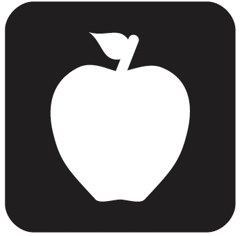
In contrast, this icon is easy to recognise, although the leaf could be drawn better. But why are we being shown an apple? It was meant to signify ‘nutrition’ but in the USA it is used as a symbol for ‘education’.
In a review of the final set of published symbols, Paul Mijksenaar & Fenne Roefs pointed out some simple truths about symbols and icons:
One of the basic rules of symbols is that they can never be considered “self explanatory.” Symbols should be considered as a visual language and as with any other language, their meaning has to be learned. Thanks to their pictorial clarity, the meaning of some symbols can be guessed, provided they are encountered in the appropriate context (airport, hospital, rail station, Olympic Games). Curiously enough, many road signs lack a visual cue to their meaning (like the signs for “no parking,” “major road,” and “no entry”), but since learning their meaning is mandatory for car drivers, they still work. That is, they work to a certain extent because many symbols still are misinterpreted or confused with other symbols.2
Paul is a leading wayfinding designer, famous for his systems for Schiphol and JFK airports. In a multilingual travel context, symbols are of course essential. Since people are travelling between at least two airports, designers should not reinvent symbols for common features where one already exists in general use. This is true to some extent for all symbols.
1. SEGD / Hablamos Juntos (2010) Universal Symbols for Healthcare
2. Paul Mijksenaar & Fenne Roefs (2015) The SEGD/Hablamos Juntos Healthcare Symbols – Will They Work?, SEGD