
Because it is laid out in columns, this site doesn't display properly on a phone held vertically.
Please turn it sideways.
Because it is laid out in columns, this site doesn't display properly on a phone held vertically.
Please turn it sideways.
The minimum graphic difference that is significant and memorable.

The minimum graphic difference that is significant and memorable.
The minimal difference that can be detected by the human eye is sometimes known as the difference threshold, or the Just Noticeable Difference.
But differences in graphic design need to be more than only just detectable. So I prefer to speak of the Minimally Useful Difference.
The difference between a 1 pt rule (line) and a 4 pt rule is easily seen. However, the difference between a 0.75 pt and a 1pt rule may be just about detectable, but it is not significant enough to be used in an information hierarchy. The principle applies to colour, typefaces and other design features used to encode information.
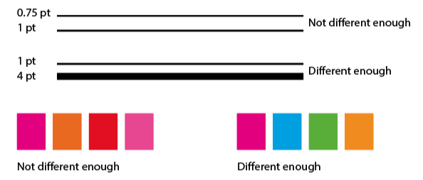
The difference threshold is rarely enough to create a sufficiently contrasting set of graphic signals. For example, in a colour coding system it can be hard to relate similar colours on, say, a map to the colours in the key. Our perception of colour is very influenced by the colours next to it, and by the size of the coloured image.
And when using the same typeface family for headings and text, make sure there’s enough contrast. So if you use, say, a light weight for your text, the regular weight will not be bold enough for headings. You need to move up the scale at least one more step.

If you are in doubt about your design choice, use the squint test to see if your difference survives.