
Because it is laid out in columns, this site doesn't display properly on a phone held vertically.
Please turn it sideways.
Because it is laid out in columns, this site doesn't display properly on a phone held vertically.
Please turn it sideways.
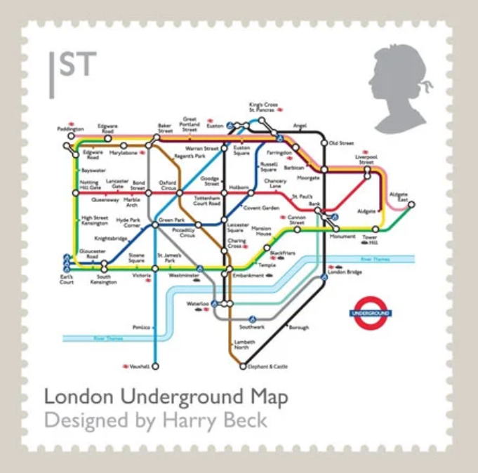
The London tube map has been an information design icon since it was introduced in 1931.

The London tube map has been an information design icon since it was introduced in 1931.
The London tube map, designed by Harry Beck, is known to anyone who has been to London, and many who have not. Although radical in its day, it was an instant success. It is central to the history of information design, and everyone who practises, teaches or researches information design sees it as an iconic example of the art.1
It exemplifies some key information design principles, and also represents some of the trade-offs and compromises we have to make.
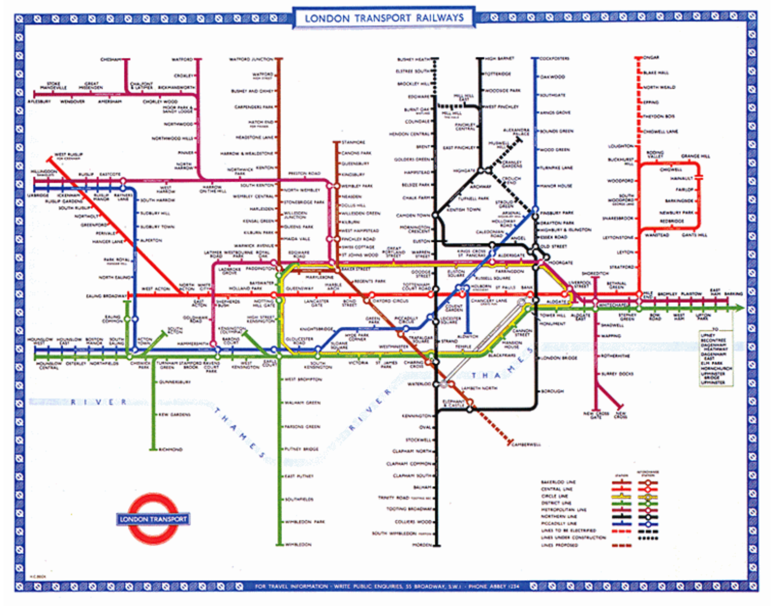
Although it is a network diagram, not a geographical map, it forms the mental image of London for many people. At times it is quite misleading, so people sometimes end up taking complex journeys to destinations they could have walked to more quickly. Psychologist and tube map expert Maxwell Roberts advises us to think of it as a journey planner, not a map.
The scale of the central area is exaggerated because there is so much information to display, while the outer areas are drastically shrunk in order to fit on the page. It forces the tube lines into a restricted set of angles to simplify the layout, but this further distorts geography.
Maxwell Roberts has explored numerous alternative ideas for displaying the tube network, and has written extensively about transit maps in general.2 The London map is a solution for London, and hasn’t always translated well when it’s been applied to other cities.
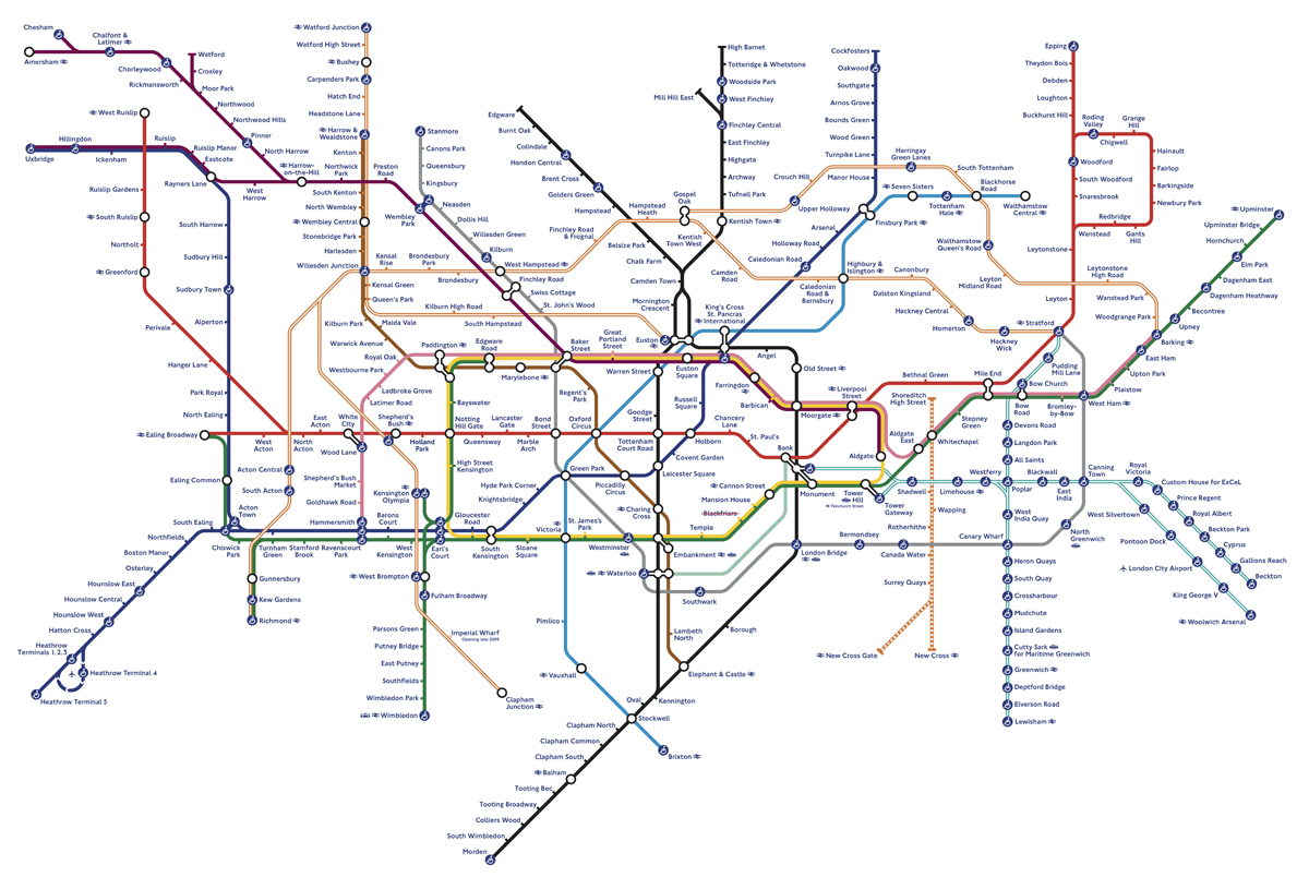
Every time Transport for London (TfL) alters the Tube map, it amounts to a switch test of the format. When a new route is added, or when new ideas such as fare zones are introduced, we can ask: does it make it easier to understand or not.
Aware of its ever-growing complexity, in 2009 TfL removed the River Thames from the map, having assumed that it was inessential. There was an immediate public backlash and the Mayor of London intervened to have the river restored.3
Although TfL had thought it was unnecessary clutter, the river turned out to have a purpose in the eyes of its users.
As one Guardian reader commented:
‘The river is the equivalent of a “You Are Here” starting point for the zillions of people needing it to get their bearings while they learn London’.
1. London Transport Museum, Mapping London: the iconic Tube map
2. Maxwell Roberts (2017) Underground maps unravelled, Capital Transport Publishing. I reviewed this book in Eye magazine.
3. Patrick Barkham (2009) Where has my beloved Thames gone? The Guardian, 17 September 2009.