Because it is laid out in columns, this site doesn't display properly on a phone held vertically.
Please turn it sideways.

Because it is laid out in columns, this site doesn't display properly on a phone held vertically.
Please turn it sideways.
This is very basic stuff. If you trained as a designer you don’t need to read this.


This is very basic stuff. If you trained as a designer you don’t need to read this.

If you are designing a text with more than a few paragraphs, your priority is to make it easy to read.
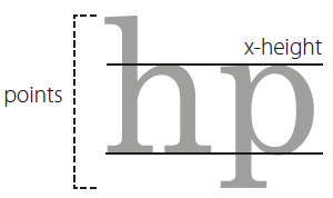
Your font should be large enough. In their Clear Print guidelines, the RNIB recommend an x-height of 2mm for general use.2 Fonts are measured in points – an old printers’ measurement that relates to the piece of metal the letter would once have sat on. The x-height refers to the height of lower case letters such as the x. If the parts that stick up or down (ascenders and descenders) are relatively long, it follows that the x-height will shrink proportionately.
You’ll notice that most sans serif fonts have large x-heights compared with serifed fonts:

Make sure the spaces between words are significantly smaller than the spaces between lines. This is a visual judgement. Because fonts with small x-heights incorporate more vertical space you don’t need to add as much. I would start by setting line spacing to 140% of the font size, and reduce it if it looks too loose. So this means 11.5/16 pt or 10/14 pt. If you are using a word processing app such as Microsoft Word, never accept the default of single or double spacing – that’s from the typewriter era.
A good guide for line length is between 1.5 and 2.5 lower case alphabets . On office paper (A4 or US letter) this will leave you with a margin – don’t be tempted to stretch the line to fill the page. Instead, think about using the margin for headings or notes. Or don’t worry about it. Now people read so much online, white space is not ‘wasting’ paper.
You don’t need to justify the right-hand edge (this means making it straight). Unjustified type is usually known as ranged left or ragged right.

Experiment with different combinations of font, size, line spacing and line length. Don’t assume the default offered by your software or template is any good. Experiment and make your own judgement.
You should also start to notice what fonts you see in things you read. When you find something you really like, explore what choices the designer made, and learn from them.
There are some great books3 and online resources4 on typography around. It’s a confusing world, and some of the books go into a lot of fascinating detail about the history of fonts and their connections with art and culture. You don’t need to know all this when you’re starting out.
Pick a limited set of reliable, normal-looking fonts and get going. You can experiment with different flavours or ornamentation later. Some of the free fonts are great – for this website I’ve used Merriweather and Open Sans, both available from Google fonts.
1. Colenbrander, A., & International Council of Ophthalmology. (2002). Visual
standards: aspects and ranges of vision loss with emphasis on population
surveys. International Council of Ophthalmology.
2.. RNIB (2006) See it right, Royal National Institute of Blind People.
3. Phil Baines & Andrew Haslam, Type & typography, second
edition, London: Laurence King, 2005.
4. Matthew Butterick (nd). Practical Typography. Online at https://practicaltypography.com