
Because it is laid out in columns, this site doesn't display properly on a phone held vertically.
Please turn it sideways.
Because it is laid out in columns, this site doesn't display properly on a phone held vertically.
Please turn it sideways.
Things to check if you’re designing in multiple languages or communicating technical information.

Things to check if you’re designing in multiple languages or communicating technical information.
Choosing a typeface can just be a matter of what you like best out of what’s available. But, depending on the context, some of these questions might be important.
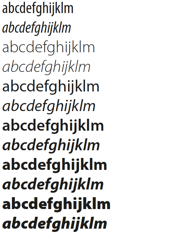
This sample shows all the weights of News Gothic when launched in 1908 - fine for most general purposes:

But because digital typeface design software makes it easier, recent typeface designs usually have many more variants available. This sample shows Myriad Pro (launched 1992, and added to since).
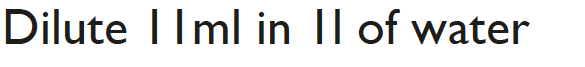
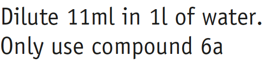
For general purposes it may not matter if the lower case L, the numeral 1 and the capital I look the same. But you should be concerned if data has to be read accurately on labels or from tables, or if you know there are many people with dyslexia among your readers. Gill Sans is notorious for this:
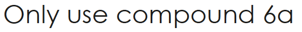
A round ‘a’ is often thought to be easier for children because it is how they are taught to write. But it is easily confused with ‘o’ (this is Century Gothic):
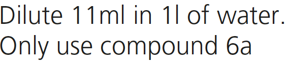
As a minimum requirement, it is important to make sure the numeral ‘1’ is distinct from the lower case ‘l’. This is Frutiger:
This typeface (Officina, designed by Erik Spiekermann) goes further – note the extra serifs at the foot of the 1 and l:
Most modern typefaces provide you with the full range of accents, Greek and Cyrillic characters: ÁŎŘŅąđĥħĵķłť / αλμνξ / БГДЖЙЛ. But if you definitely need them, check if they have what you need.
Some also have versions of other writing systems such as Arabic, designed to be compatible.
Waller, R. (2011). Choosing a typeface for reading (Technical paper 9). Simplification Centre.