
Because it is laid out in columns, this site doesn't display properly on a phone held vertically.
Please turn it sideways.
Because it is laid out in columns, this site doesn't display properly on a phone held vertically.
Please turn it sideways.
Serifs are the small strokes on the ends of letters in some typefaces. Typefaces without serifs are known as ‘sans serif’.
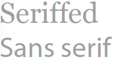

Serifs are the small strokes on the ends of letters in some typefaces. Typefaces without serifs are known as ‘sans serif’.
Faced with a choice of typefaces, people sometimes ask: do serifs matter? do they make it easier or harder to read? does it make a difference if I am designing for screen rather than paper?
Unfortunately, research does not give us a clear answer to these questions. In fact it suggests that serifs do not actually matter for reading continuous text.
Research can be found to support both sides of the debate, but any differences in performance are generally small. They are overriden by other factors such as the size of type, the overall design of the document, and lighting conditions.
The most thorough review of the research literature on the legibility of seriffed and sans serif type is by Ole Lund.1 His 1999 PhD thesis concluded that the research is not only inconclusive, but it is mostly of too poor a quality to be relied upon.
Because most common typefaces are about as legible as each other, designers can be free to choose a typeface for other reasons.
In fact, because serifs are the most visible features on which typefaces differ, when people ask ‘which is best’ they are often really asking a more general question: how do I choose a typeface?
Why have serifs at all? Because they are traditional and beautiful. Letterforms tend to reflect the visual culture of their day, whether classical, arts & crafts or modernist.
1. Lund, O. (1999). Knowledge construction in typography: The case of legibility research and the legibility of sans serif typefaces [Doctoral dissertation, University of Reading].