Because it is laid out in columns, this site doesn't display properly on a phone held vertically.
Please turn it sideways.
Because it is laid out in columns, this site doesn't display properly on a phone held vertically.
Please turn it sideways.
Two things to understand about how typography helps readers see structure and different viewpoints in text.

Two things to understand about how typography helps readers see structure and different viewpoints in text.
As well being legible (a hygiene factor) your choice of font contributes to communication in two main ways: hierarchy and voice.
A good use of typographic hierarchy and voice turns a flat text into something more like a conversation: an environment that readers can move around in, and see the status of each chunk of information.
I use the terms ‘hierarchy’ and ‘voice’ in a general way here. Hierarchy doesn’t just mean a difference in status, or a nesting relationship – the same principles apply in any place where you are trying to show structural relationships within the content.
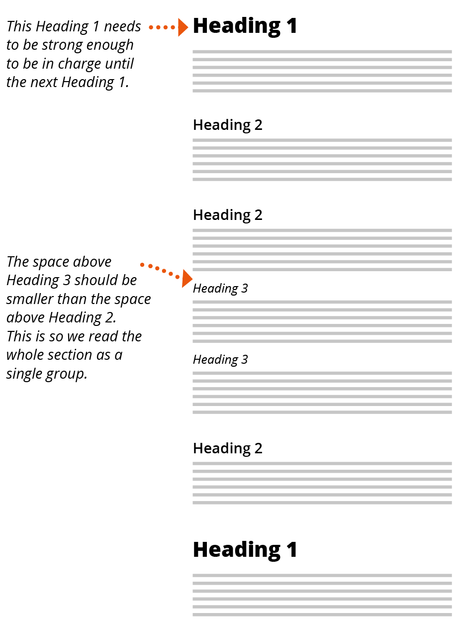
A hierarchy of headings is built into all writing and designing software. This needs to be reflected graphically through the relative sizes, prominence and spacing of headings and text.
You can also use your choice of typeface to express a distinctive voice. This may just be a matter of establishing a category of information that is not part of the main hierarchy or structure. Or it may be to convey a particular mood or personality. This obviously central to the visual identity of brands but you can also use voices such as urgency (deadlines, warnings) support (customer service number, helpful tips) or explanation.
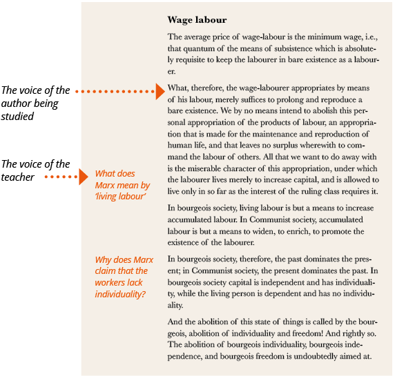
It’s quite common to find the voice of the commentator, critic or teacher in a textbook: