
Because it is laid out in columns, this site doesn't display properly on a phone held vertically.
Please turn it sideways.
Because it is laid out in columns, this site doesn't display properly on a phone held vertically.
Please turn it sideways.
Legibility research doesn’t have to be expensive.

Legibility research doesn’t have to be expensive.
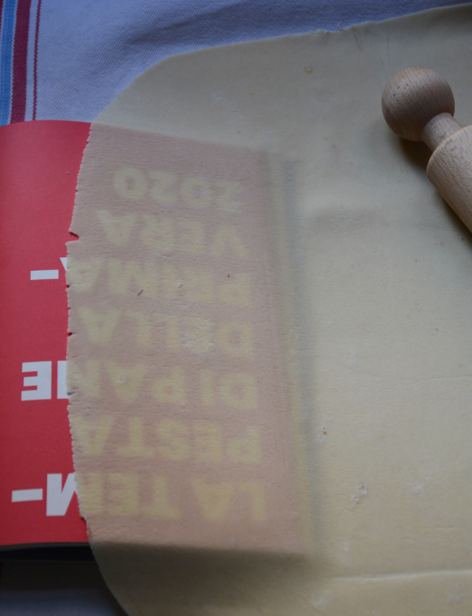
Strudel pastry is said to be thin enough when you can read a love letter through it.1
But you can use this in reverse and ask which typefaces are clear enough to read through strudel pastry... or other degraded conditions.
I have used repeat photocopying to show how delicate typefaces such as Bodoni lose their essential features more quickly than robust ones such as Helvetica.
You can also view type through tracing paper to achieve the same effect. In fact the Cambridge Simulation Glasses1 are made from layers of translucent paper to help you experience what it’s like to lose vision.
And I’ve found that optical character recognition apps prefer more legible typefaces. Here’s a demonstration.
I scanned some text with Microsoft Lens in three typefaces. One is Baskerville which is a typical book typeface, the other is Caslon Italic which most of us would think a bit less legible than Baskerville, and lastly I’ve included Pixelated, which recalls the dot matrix printers of the 1970s and which is on the threshold of legibility.
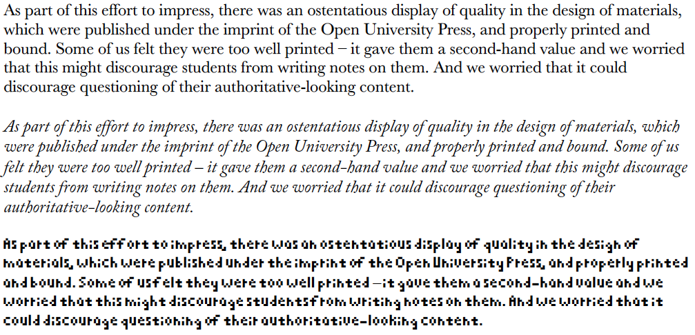
Lens read Baskerville perfectly, but it missed a lot of word spaces in Caslon Italic:

And predictably it struggled to spot any letters in Pixelate:
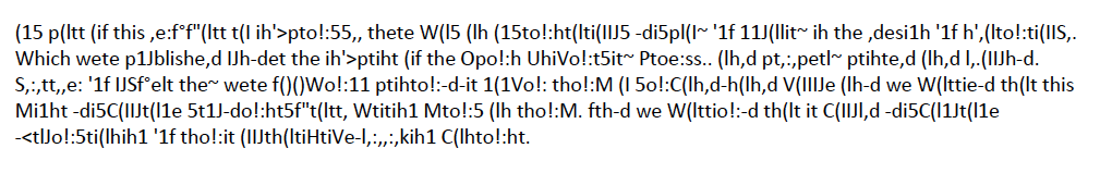
So legibility can be measured through OCR errors, and the results were exactly as predicted. Case closed!
1. Rachel Roddy (2021) Rachel Roddy’s recipe for strudel, The Guardian, 8 Feb 2021.
2. Inclusive Design Toolkit: https://www.inclusivedesigntoolkit.com/csg/csg.html