
Because it is laid out in columns, this site doesn't display properly on a phone held vertically.
Please turn it sideways.
Because it is laid out in columns, this site doesn't display properly on a phone held vertically.
Please turn it sideways.
Some of these rules are not strictly functional, but getting them right gives readers confidence in your professionalism.

Some of these rules are not strictly functional, but getting them right gives readers confidence in your professionalism.
There are many subtle rules for setting text, which good copy-editors and typographers are aware of. These are the main ones, in my experience, to get right if you want to avoid looking amateur.
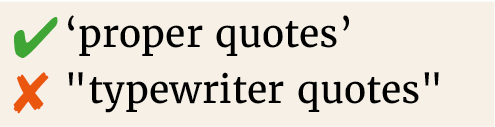
Not the stab marks that originate on typewriters. Thankfully, Microsoft Word will sort this for you if you accept its default Autocorrect settings.
You can use em rules with no spaces around—like this. Or you can use en rules with spaces – like this. But be consistent and never ever use hyphens instead of a dash - like this. Again, Microsoft Word should take care of this.
This is still a requirement for many US publishers,1 although I suspect it’s beginning to look amateur and old-fashioned there too.
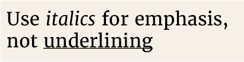
This comes from typewriters and cuts through the descenders of letters.
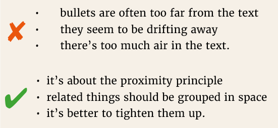
Don’t accept the default spacing, as it’s usually much too wide. The bullet needs to be closer to its following text than to the other bullets.
Don’t use leader dots between the item and its page number. Better still, the page number can just follow on from the item, with two or three word spaces between. There’s no need for them to line up.
Get yourself a copy of Hart’s Rules, from Oxford University Press for the full story.
1. In a nice piece about the Guardian’s style guide, David Marsh observes ‘Opinions vary as to which of these usages is “American”; my inbox suggests that this term is employed by British readers to describe whichever aspect of style they don’t happen to like.’
David Marsh (2016) ’Quotations "within quotations": the Russian doll of punctuation’ The Guardian, 4 March 2016.
2. Thanks to Paul Luna for this list, from course materials at the University of Reading.